I have a confession – I love the Arizona State Fair. My wife and I go every year – but not for the rides. We go for the food – just the food. Seriously, where else can you find so much tasty goodness in one place; funnel cake, hot dogs, sausages, pizza, and my favorite – a giant BBQ turkey leg and fries with melted cheese drizzled over the top. By far the worst thing for you, but so amazingly good, it’s worth the artery clogging cholesterol and the subsequent 15 hours at the gym the next day.
So what does this have to do with design and rendering?
If I didn’t know what amazing culinary treasures lay in wait down the food aisle of the state fair, I probably would never walk around that general area. The fact is the food aisle at most state fairs consist of prefab sheds with some kind of tacky lighting and almost impossible to read menus. Furthermore, the walkways between booths are obstacle courses fraught with haphazardly placed trash cans and condiment stations, all lit with a 4 watt light bulb. Each booth is stacked right on top of the other with lines that seem to have no rhyme or reason, and often end up colliding with one and other. You could stand in line for an hour waiting for a tasty polish sausage only to end up at the fat free yogurt stand. Then of course, finding a seat becomes an impossible mission – especially when carrying a tray heaped with mouth watering deliciousness.
 |
| Standard concession stands. |
 |
| Stands literally on top of each other |
 |
| More smashing in of stands and signage. |
A client of mine had an idea to fix that problem. He proposed creating a much nicer concession stand that would play up to its surroundings. His idea – make the stand look like the thing you're selling. While this idea isn’t particularly new or anything (remember the banana stand in “Arrested Development”), his idea was to bring that concept to the next level.
 |
| The Bluth's Banana Stand from "Arrested Development" |
 |
| A themed concession stand. |
 |
| The Long Island Duck - I have no idea what is inside this thing. |
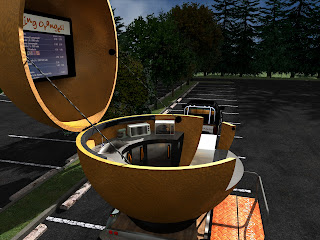
Our first attempt at exploring this concept was with an orange-shaped concession stand. Perhaps they would sell orange flavored smoothies (like an Orange Julius) or ice cream or something else orange related. The stand itself would be rather large – about 19’ in diameter and able to accommodate up to 3 employees.
The stand would contain blenders, refrigerators, freezers, microwaves and other appliance needed for that particular food vendor.
The entire stand would be mounted on a trailer for easy towing and storage. The top of the orange would be on a massive hinge so it could open up, allowing the employees to work in a semi-open air environment, instead of being cooped up in cramped shack. Due to the height of the stand, the top portion could be removed and towed separately on another trailer, making it possible to navigate under overpasses or through tunnels (although a stand this big would be given a wide load designation). The stand would also have its own self contained queue, giving better order and direction to what usually is a migraine inducing nightmare called a line at the fair.
When the time comes to move the stand to its next location, the entire thing basically folds into its self. The top can come down (or be removed), the elevated deck and stairs fold up against the hull of the orange, and all of the speed rails (handrails) can be packed into storage areas contained on the trailer.
Hopefully, I will be working on more of these ideas if the client decides to pursue this further. I for one would be very happy to visit this stand, even if they just offered orange flavored yogurt.
Feel free to share your concession stand nightmares with us; or, if you have found unique stands that you would like to share, send us a link in the comments section of this blog!
Happy eating!


