Hello All! Late last year, I had lamented about the amount of time that I had taken off from writing on my blog site and how I wanted to get back into the habit of posting again. I have, in fact, kept up with posting fairly regularly, and I have been happy to see that my readership is at an all time high. However, I think part of being a good blogger is looking for other people's work and posts. Therefore, yesterday, I went on a hunt for blogs that related not only to my industry, but to the programs that I use in my industry. I am happy to report that I found some good ones that I think are worth checking out:
- Official Google Sketch Up Blog - I use Google Sketch Up for all of my modeling needs. I love this program - I think it is highly intuitive and generates models on the same level as 3D Max or Maya for a lot less money. If you have any desire to start learning how to model, then download this program. Google offers a free non trial version as well as a pro edition along with tons of plug-ins.
- 3DS Max Rendering - So, now that I just talked up Sketch Up, let me explain why I am following this blog. First of all, it's always good to be aware of what else is out there and what other people are doing. Secondly, there are definitely things that you simply cannot do with Sketch Up. I love 3D design and animation in all of it's forms, and enjoy what others do with it.
- Brush Work - This blog is maintained by Sunil Pant, a gentleman whose work caught my attention in my hunt for new blogs to read. Among other art forms, Mr. Pant is a fantastic 3D artist who uses Sketch Up for his modeling. I will be paying close attention to his work, as I think I could definitely learn a thing or two. He also has a website.
- Mike Doscher Illustrations - I have been a fan of Mr. Doscher's work ever since I found him on DeviantArt about a year and a half ago. His illustrations are just amazing, and I would highly recommend checking them out.
- Architectural Rendering - This is an industry specific blog, and more importantly to me, it is specific to my exact industry - architectural design and rendering. This blog is a showcase of work and advice for a very competitive and fast paced profession.
- Architectures - This is another industry specific blog. Lately, they have been running a series on renderings vs. hand illustrations and it is this series that got my attention. When I have more time, I will be looking at older posts by this blogger.
I have added a feed to all of these blogs on the right hand side of my page. As the authors update their sites, the panel on the right will also be updated to reflect new posts.
Of course, please don't forget about my site - www.lonewolfdrafting.com!
Happy reading!
Thursday, February 24, 2011


Saturday, February 19, 2011
A Quickie

Hello All - I just wanted to take a moment to thank all of my readers who visit my blog and leave comments - I love to read them. I also wanted to take this opportunity to apologize for not responding back. While I enjoy writing my blog entries, I don't necessarily know all of the "ins-and-outs" of Blogger. However, that has changed today.
I have set my comment notification option to "send notification", so for those of you who do comment, I will respond back to you in a much more timely manner.
I also had to add the "captcha" feature - personally, I hate this thing, but I had hundreds of spam emails, so I figured it was time to enable it. I hope this does not sway people from leaving comments.
Again, just a big thanks to everyone who stops by and reads my posts - it means a lot. I would encourage other readers to say hello, too; and if you have a blog or website (that is not spam), leave a link - I would be happy to check it out!
Thanks again!
Sean DiVincenzo
Lone Wolf Drafting and Design
www.lonewolfdrafting.com
Monday, February 14, 2011
Home Sweet Home – Part Two
Website Update!!
Before starting the new blog entry, I wanted to inform my readers that my site has been updated! Since the completion of two more garages, I have reorganized the “Real vs. Rendered” page of my site. This will make it much easier to navigate the projects listed in this section and will reduce load time for the overall page.
The Command Center
Yes, my office is called the Command Center, so let’s just get that out of the way right now. I do everything from my office; my design work, renderings for clients, internet searches, viewing movies from Hulu and Netflix, listening to music and the Opie and Anthony Show just a name a few activities. When things get busy, I eat and sleep in my office. If the Xbox were in here, I would never leave this space.
This is how it has always been, especially since I went into business for myself. My first office was in my apartment in Mesa – it was a pretty large space, but sparse – I had a computer desk, my drafting desk, a book shelf and a filing cabinet. My office in Surprise was drastically smaller and far more cramped and not nearly as fun to be in do to its very compact size. That space was actually cavernous compared to the next place – the apartment in the Executive Tower. My office was a small section of the living room – it was literally just a desk and chair in a 5 foot by 5 foot (25 sq.ft.) of space. It was a tight year.
 |
| The apartment at the Executive Tower - my desk is behind the couch. |
So, when Allie and I bought our first home together (see the story of the renovation here and here), I decided I was going to put together my perfect office. It is still a work in progress, but I would say I am 95% there (we will get to that later). The first order of business was color selection. All of my past home offices were always white – boring. I decided to go bold in this one – Venetian Stucco for 3 walls and a punch of bold Red Delicious for my accent wall. The only things I left original to the room were the wood baseboards and hand plastered ceiling.
 |
| Venetian Stucco |
 |
| Red Delicious |
In past offices, I had an L-shaped desk and my drafting table (it is an amazing full sized iron and wood mechanical drafting desk from 1955 – it now resides in my wife’s office). These two items took up most of the space, and left room for little else. It was decided early on that I would part with my drafting desk provided I could find a regular desk that would fit my needs and my small budget. The frosted glass L-shaped desk was sold off when we moved from our house in Surprise as there was no room for it in apartment. So, I would need to purchase 2 desks for this idea to work, and reverse the second one.

Okay, not a bad solution, but not my favorite, and certainly not worthy of the departure of my beautiful drafting desk. Add to that the price tag of $200.00 for two new desks, and this idea quickly lost merit. One day, Allie and I went out to IKEA to look for storage solutions and desks. Allie spotted a desk that had a storage unit on one side and a sawhorse support on the other – I was very intrigued. In a combined flash of brilliance, Allie and I headed over to Home Depot to look into the possibility of building my own unique desk.
I was definitely on board with the sawhorse leg idea. Home Depot had the Task Force metal sawhorse for sale for about $30.00 ($60.00 for 2). The nice thing about these, other then their steel construction, is that you can adjust the height – perfect for setting the height of a desk.

I then went over to the lumber department to pick out 5 6”x2”x10’ long boards that would make the desk top as well as ebony colored stain. By the time all was said and done, I had built the deck of an aircraft carrier – fantastic. I have plenty of room for my computers, printer, scanner and other assorted equipment and peripherals. I love this thing. The total cost came out to about $110.00 total – the cheapest solution in the desk hunt.


 |
| For more circulation under the desk, I reused the vent fans from the home renovation |
Once the desk conundrum was solved, the rest of the office just sort of fell into place. I put in a nice display case for various memorabilia, my antique 1955 Zenith stereo, file cabinets and another storage unit. I also added small rug circles just for fun.


 |
| Jack, the company mascot. |
The only thing left on the list are the window dressings, which will be heavy roman shades that my wife is making for me and swapping out the ceiling fan for something a bit more “me”.
 |
| Original wood doors and trim. |
 |
| Original hand plaster swirl pattern. |
 |
| Ceiling fan that I want to either renovate or replace. |
Still to come: painting the house and cabinet renovation.
Wednesday, February 9, 2011
New Projects Installed!
Recently, one of my best clients, GarageMahals, informed me that two garage designs that I rendered were installed. To me, this is just as exciting as Christmas morning. I love to see how close I got to the actual installed product. So, here they are:
The Chicago Garage:
This garage centered on a Las Vegas theme, and had a few modifications done to it during the construction process. The most notable differences can be seen along the left side of the garage where the cars are parked. The original design called for a double-decker car storage system with a mechanic’s bay in the back left corner. The actual installation consisted of a single row of cars and no mechanic’s bay.
 | |
| Rendered image - mechanics bay and elevated deck |
 |
| Rendered image - elevated car deck |
 |
| Actual photo of finished bay |
The vaulted ceiling in the back also had some changes, the biggest being the lack of a trellis graphic (and then later, a faux window with columns) on the large garage door.
 |
| Rendered image - trellis graphic. |
 |
| Rendered image - window and columns. |
 |
| Actual photo - note the alcove toward the back right. |
The only other major difference was the children's play area, which had to be altered to meet fire codes.
 |
| Rendered image - kid's play space. |
 |
| Actual photo - note the fire door on the angled wall to the right. |
The office, which features a Caesar’s Palace style temple front, is spot on to the renderings, as is the large, semi-circular bar.
 |
| Rendered image - "Hard Eight Trading" office front. |
 |
| Rendered image - semi -circular bar. |
 |
| Rendered image - Las Vegas sign. |
 |
| Actual photo - note the Las Vegas sign and temple front. |
All in all, I am very happy with how these images compare to the actual installation.
Steelers Garage:
This installation, by far, is the closest between rendering and actual installation. There are literally three differences:
- The diamond deck pattern on the wainscoting is larger than what I showed.
- The Pittsburgh Steelers graphic was left off the header, and was left as a steely gray front.
- The "Terrible Towel" graphic was replaced with a diamond pattern graphic.
Other then those difference, everything is spot on.
 |
| Rendered image - both bays. |
 |
| Rendered image - both bays. |
 |
| Actual photo - note the headers without the graphic and the diamond pattern stripe down the center. |
 |
| Rendered image - rolling storage doors. |
 |
| Actual photo - rolling storage doors. |
 |
| Rendered image - door graphic and wainscoting. |
 |
| Actual photo - door graphic and wainscoting - note the larger diamond deck pattern. |
 |
| Rendered image - window covers and lockers. |
 |
| Rendered image - window covers. |
 |
| Actual photo - window cover and lockers (at the far end by the doors). |
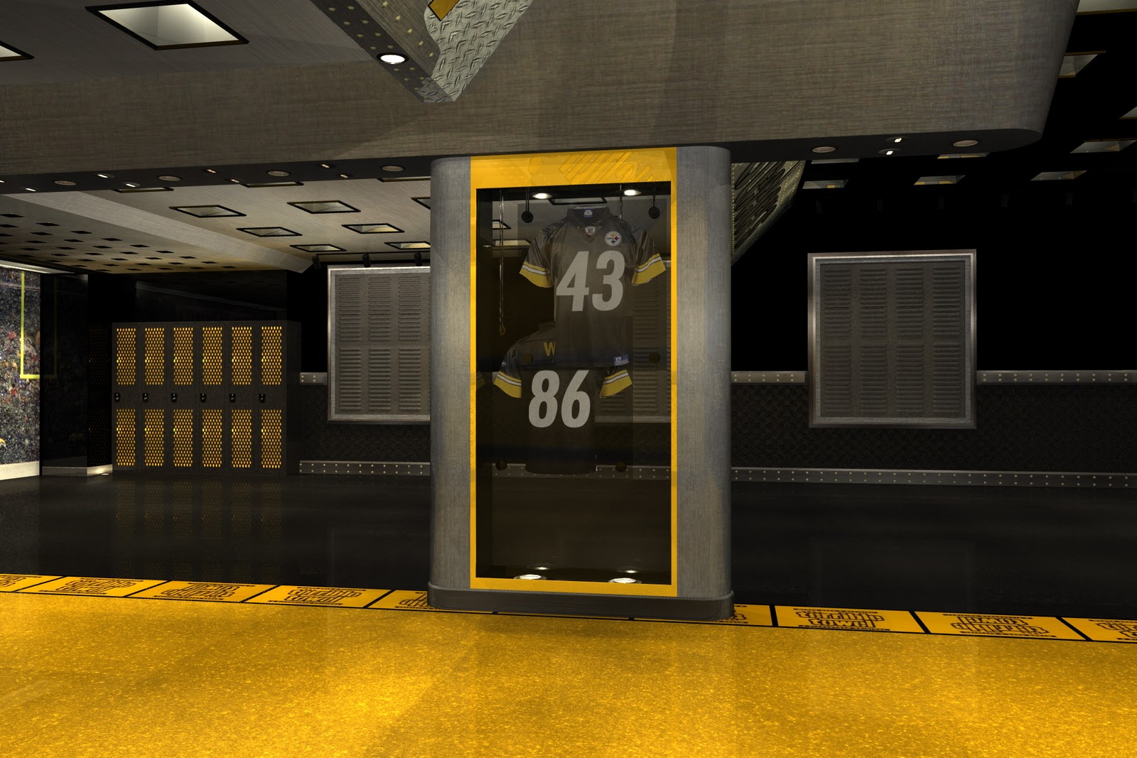 |
| Rendered image - display case. |
 |
| Actual photo - display case. |
 |
| Rendered image - garage door graphics. |
 |
| Actual photo - garage door graphics. |
Do you have (or have images of) a unique garage? If so, add a link in the comments portion of this post!
Sunday, February 6, 2011
Your Food (Stand) is Problematic.
I have a confession – I love the Arizona State Fair. My wife and I go every year – but not for the rides. We go for the food – just the food. Seriously, where else can you find so much tasty goodness in one place; funnel cake, hot dogs, sausages, pizza, and my favorite – a giant BBQ turkey leg and fries with melted cheese drizzled over the top. By far the worst thing for you, but so amazingly good, it’s worth the artery clogging cholesterol and the subsequent 15 hours at the gym the next day.
So what does this have to do with design and rendering?
If I didn’t know what amazing culinary treasures lay in wait down the food aisle of the state fair, I probably would never walk around that general area. The fact is the food aisle at most state fairs consist of prefab sheds with some kind of tacky lighting and almost impossible to read menus. Furthermore, the walkways between booths are obstacle courses fraught with haphazardly placed trash cans and condiment stations, all lit with a 4 watt light bulb. Each booth is stacked right on top of the other with lines that seem to have no rhyme or reason, and often end up colliding with one and other. You could stand in line for an hour waiting for a tasty polish sausage only to end up at the fat free yogurt stand. Then of course, finding a seat becomes an impossible mission – especially when carrying a tray heaped with mouth watering deliciousness.
 |
 |
| Standard concession stands. |
 |
| Stands literally on top of each other |
 |
| More smashing in of stands and signage. |
A client of mine had an idea to fix that problem. He proposed creating a much nicer concession stand that would play up to its surroundings. His idea – make the stand look like the thing you're selling. While this idea isn’t particularly new or anything (remember the banana stand in “Arrested Development”), his idea was to bring that concept to the next level.
 |
| The Bluth's Banana Stand from "Arrested Development" |
 |
| A themed concession stand. |
 |
| The Long Island Duck - I have no idea what is inside this thing. |
Our first attempt at exploring this concept was with an orange-shaped concession stand. Perhaps they would sell orange flavored smoothies (like an Orange Julius) or ice cream or something else orange related. The stand itself would be rather large – about 19’ in diameter and able to accommodate up to 3 employees.


The stand would contain blenders, refrigerators, freezers, microwaves and other appliance needed for that particular food vendor.


The entire stand would be mounted on a trailer for easy towing and storage. The top of the orange would be on a massive hinge so it could open up, allowing the employees to work in a semi-open air environment, instead of being cooped up in cramped shack. Due to the height of the stand, the top portion could be removed and towed separately on another trailer, making it possible to navigate under overpasses or through tunnels (although a stand this big would be given a wide load designation). The stand would also have its own self contained queue, giving better order and direction to what usually is a migraine inducing nightmare called a line at the fair.
When the time comes to move the stand to its next location, the entire thing basically folds into its self. The top can come down (or be removed), the elevated deck and stairs fold up against the hull of the orange, and all of the speed rails (handrails) can be packed into storage areas contained on the trailer.


Hopefully, I will be working on more of these ideas if the client decides to pursue this further. I for one would be very happy to visit this stand, even if they just offered orange flavored yogurt.
Feel free to share your concession stand nightmares with us; or, if you have found unique stands that you would like to share, send us a link in the comments section of this blog!
Happy eating!
Subscribe to:
Posts (Atom)